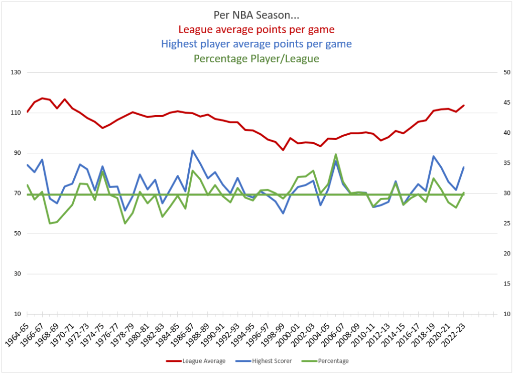
The red line is the average amount of points that a team scored during a given season (left axis). The blue line is the amount of points that the league leader scored per game (right axis). The green line is the percentage of points that the league leader scored in relation to the average amount of points that the team scored.
Take for example the ’05-’06 season where Kobe scored an average of 35.5 PPG while the team average was 97 PPG. So Kobe averaged 36.6% of the team average.
The green horizontal line is the average of all the percentages. The purpose is to put scoring in perspective across all seasons. In ’88-’89 Michael Jordan averaged a league high of 32.5 PPG, but that was a high scoring season league wide. The league averaged over 109 points and so there were just a lot of points available. MJ’s percent of the team average was 32.5/109=29.8%. In ’02-’03 Tmac scored a league best of only 28 PPG but teams were only averaging 95. The league was a different sport at the time. His 28 PPG (28/95=29.4%) was statistically almost identical to MJ’s 32.5 PPG from a decade before.